Friday, April 29, 2011
Understanding the Basics of Color
What is color?
The color of an object is seen by the eye when white light is shone upon the objects surface. This then reflects some colors and absorbs others. It is the reflected light (or wavelength) that is picked up by the eye.
Within the eye, the retina contains receptors called rods and cones. The cones react to color wavelengths whilst the rods react to brightness. There are three types of cone: red, green and blue. Each color has a different wavelength - blues, greens and violets have shorter wavelengths, while reds, oranges and yellows have longer wavelengths. When color wavelengths falls on the retina, the brain interprets the signals as color.
What is a color wheel?
An abstract illustrative organization of color hues around a circle, that shows relationships between primary colors, secondary colors, complementary colors, etc.
Types of Colors
Primary Colors - These are colors that cannot be created through the mixing of other colors. They are colors in their own right. The three primary colors are RED - YELLOW - BLUE.
Secondary Colors - Primary colors can be mixed together to produce SECONDARY COLORS
For eg: Yellow + Blue = Green
Tertiary Colors - Colors made by mixing one primary color with one secondary color.
Complimentary Colors - Colors opposite to each other on a color wheel usually work well together as a color scheme. These are known as COMPLEMENTARY COLORS.
Complete List of Colors:
The Complete listing of all the colors can be found here.
http://en.wikipedia.org/wiki/List_of_colors
Colors in Design
There are different ways to define colour particularly within design. The most common terms used are the colour values RGB and CMYK described below. Understanding how colour is produced will help a designer decide which colour value to use when creating images on the computer.
RGB
RGB stands for red, green and blue. These are known as additive primary colours. When red, green and blue light are added together in equal quantities they produce white, whilst the absence of these colours create black. In theory, all colours of the spectrum can be created by combining different amounts of red, green and blue light. Computer monitors display colour using RGB. If creating work to be used on screen only, then RGB will be the most effective mode to use. Within the RGB system, each colour has a numeric value with 0 being dark and 225 being bright, therefore listing a numeric value for red, green and blue will create a particular colour.
CMYK
CMYK stands for cyan, magenta, yellow and black. These are known as subtractive primaries. Before the colours are mixed, they are considered pure; when mixed they are not pure as the colours have been combined, hence the term subtractive. Printers use CMYK, sometimes referred to as 'four-colour printing.' Numeric values are also assigned to CMYK based on percentage values; 0% is the lightest with 100% being the darkest, therefore defining percentage values to CMYK will create a specific colour.
As computer screens and printers display and produce colour in different ways, that results in the variation of colour in a printed image and what is seen on screen. Care must be taken when working with colour on screen as the colour chosen may not be the colour which is printed.
Color Schemes
A color scheme is the choice of colors used in design for a range of media. For example, the use of a white background with black text is an example of a basic and commonly default color scheme in web design.
Resources for Color Schemes
Here are some online resources which will help you build a customized color scheme.
http://www.colorblender.com/
http://kuler.adobe.com/
Sample Composition Created from a Color Blender Scheme:
Sunday, April 24, 2011
Photoshop Tutorial: Apple Text Effect
A Silly/Simple Photoshop tutorial. I'll show you an easy way to create a text effect which is used ( i think patented:) ) by Apple,inc.
1. Type in 'iPad' on a blank document in Photoshop
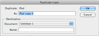
2. Rasterize the layer and duplicate it
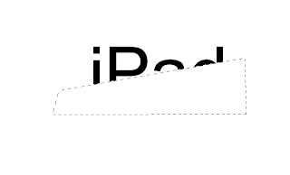
3. Make a selection like shown in the picture and delete that portion from the top layer.
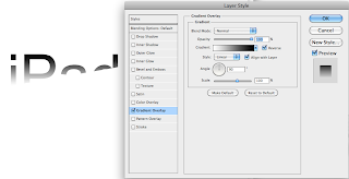
4. Double click the layer to bring up the layer options and fill the layer with a gradient as shown in the picture.
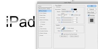
5. Turn on the bottom layer and apply a drop shadow
Saturday, April 23, 2011
Tutorial: Making the Monsters
Here to all my indie-movie friends, an interesting technique worth noticing.
What might come handy on a shoe string budget production are a set of simple-to-achieve techniques which you can easily use to create a convincing shot. Take a look at the shot below. I will break it down for you in a few seconds.
Tips to keep in mind before the shoot:
1.Carry a tripod.
2.Shoot the background on a tripod and keep it shake free.
3.Shoot the same background handheld
4.Watch out for real monsters
Things needed at the post production table:
1. The tripod shot
2. The handheld shot
3. Any Compositing Software. Here I am using Adobe AE CS5
4. The Sign Board Image for Adding to the background
The Concept:
What we are gonna do is actually very simple to understand. We now have two videos. One with the shake and one without the shake.The ideal way is to motion track the handheld footage and apply the data to the Signboard image. BUT unless you do a very very detailed tracking, chances are high that your Signboard will just dance around. So here is a smart way out. Create a composition which is dimensionally lower than the actual footage.Import the Hand held footage. Motion track the footage and we take the motion tracker data and apply it to the steady footage and the signboard, SO THAT we will get a perfectly synced composite.
*You can also use an image instead of a video.
The Break down:
1 Import the footages and the signboard.
2.Motion track the video
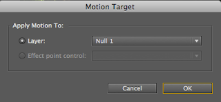
3.Create a Null Object and apply the motion tracker data on to that.
4.Now drag the sign board and the steady cam footage to the composition
5.Link both to the Null object. Now the motion tracker data is applied to both those layers.
6. Thats it! A little color correction and your shot is good to go!
What might come handy on a shoe string budget production are a set of simple-to-achieve techniques which you can easily use to create a convincing shot. Take a look at the shot below. I will break it down for you in a few seconds.
Monsters-Test from Paper Bird on Vimeo.
Tips to keep in mind before the shoot:
1.Carry a tripod.
2.Shoot the background on a tripod and keep it shake free.
3.Shoot the same background handheld
4.Watch out for real monsters
Things needed at the post production table:
1. The tripod shot
2. The handheld shot
3. Any Compositing Software. Here I am using Adobe AE CS5
4. The Sign Board Image for Adding to the background
The Concept:
What we are gonna do is actually very simple to understand. We now have two videos. One with the shake and one without the shake.The ideal way is to motion track the handheld footage and apply the data to the Signboard image. BUT unless you do a very very detailed tracking, chances are high that your Signboard will just dance around. So here is a smart way out. Create a composition which is dimensionally lower than the actual footage.Import the Hand held footage. Motion track the footage and we take the motion tracker data and apply it to the steady footage and the signboard, SO THAT we will get a perfectly synced composite.
*You can also use an image instead of a video.
The Break down:
1 Import the footages and the signboard.
2.Motion track the video
3.Create a Null Object and apply the motion tracker data on to that.
4.Now drag the sign board and the steady cam footage to the composition
5.Link both to the Null object. Now the motion tracker data is applied to both those layers.
6. Thats it! A little color correction and your shot is good to go!
Subscribe to:
Posts (Atom)